


BAYA BAYA
Project Type:
Brand Identity Design, Packaging Design, Print Design
Skills Shown:
This project demonstrates a confident grasp of colour theory, typography, and brand strategy all shaped around a mission to energise, refresh, and leave a lasting impression.
Using a strong foundation in brand design, I transformed a minimal brief into a bold, cohesive visual identity that captures BAYA BAYA’s vibrant personality and purpose.
PROJECT OVERVIEW
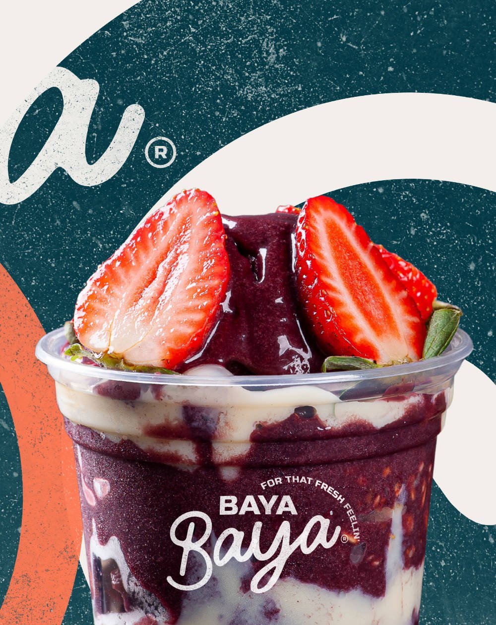
Designed for a community of acai-lovers on the go, this brand identity packs as much punch as the bowls themselves. From bold type and juicy palettes to cheeky copy and swirl-loaded layouts, every element was built to bottle that “fresh feelin” and turn it into a movement.
MY MISSION
Position BAYA BAYA as more than just an acai bar, make it a lifestyle. A feel-good ritual. The brand was built to radiate positivity, movement, and attitude from the expressive hand-lettered logo to the sunshine-swirl graphics and snappy tagline: “For that Fresh Feelin”


PRINT DESIGN
A bold, feel-good print moment designed to stop passers-by in their tracks. This street-facing sign pairs vibrant photography with confident, layered typography to instantly communicate Baya Baya’s personality: fresh, welcoming, and full of flavour.
The playful composition draws focus to the product, while the textured teal backdrop adds depth and warmth. Designed to be eye-catching without shouting, it’s all about balancing visual impact with brand consistency.
A perfect example of how thoughtful print design can do a lot with a little and still stand out on a busy street.

PACKAGING DESIGN CONCEPT
I designed a standout container that speaks in Baya Baya’s tone of voice — vibrant, playful, and confident. The tub features layered typography, minimal yet expressive color blocking, and a sense of movement that reflects the brand’s high-energy personality.
Typography-led Design: Oversized, confident messaging wraps the packaging, building instant visual impact.
Material-Led Feel: The textured finish softens the design and hints at natural freshness perfect for a health-focused product.
Lid Copy: “Unlock That Fresh Feelin’” gives the customer a moment of joy right before their first bit


From Concept to Creation let me help your business thrive with bold, bespoke and brilliantly branded visuals. Get in Touch today! ↓